
Let’s be forthright here – like we usually are. Debates about flyers and posters promoting events are as old as time itself – and DJs rowing about where on a JPEG they went is nothing new either. If you were to take a time machine and go back a few centuries, chances are classical composers and poets also bickered and moaned about which order their names were scribed onto parchment.
And tastes change over time, too. The posters which emerged to promote the few legal raves in the 1980s were basic in design – often deliberately so. Whereas today, the Tomorrowland design of having 17 million names listed on a 400×400 pixel size image is the preferred format of many festivals.
And if all else fails, there was a strategy in the 90s of just putting an attractive woman on the front of the poster. Whether it actually resulted in any more tickets being sold is something we suspect wasn’t really checked much during this hedonistic era.
Occasionally however, event organisers went a tad too far. Here’s a heavily censored photo of a poster from a London night out in 2009…
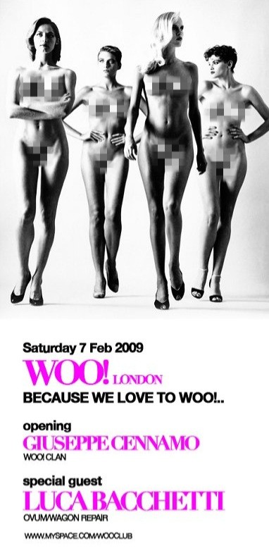
It’s just not the sort of advert you’d see these days, is it? And we’re not just referring to the MySpace link at the bottom of the poster. The full strictly NSFW version is up in Resident Advisor’s archive…