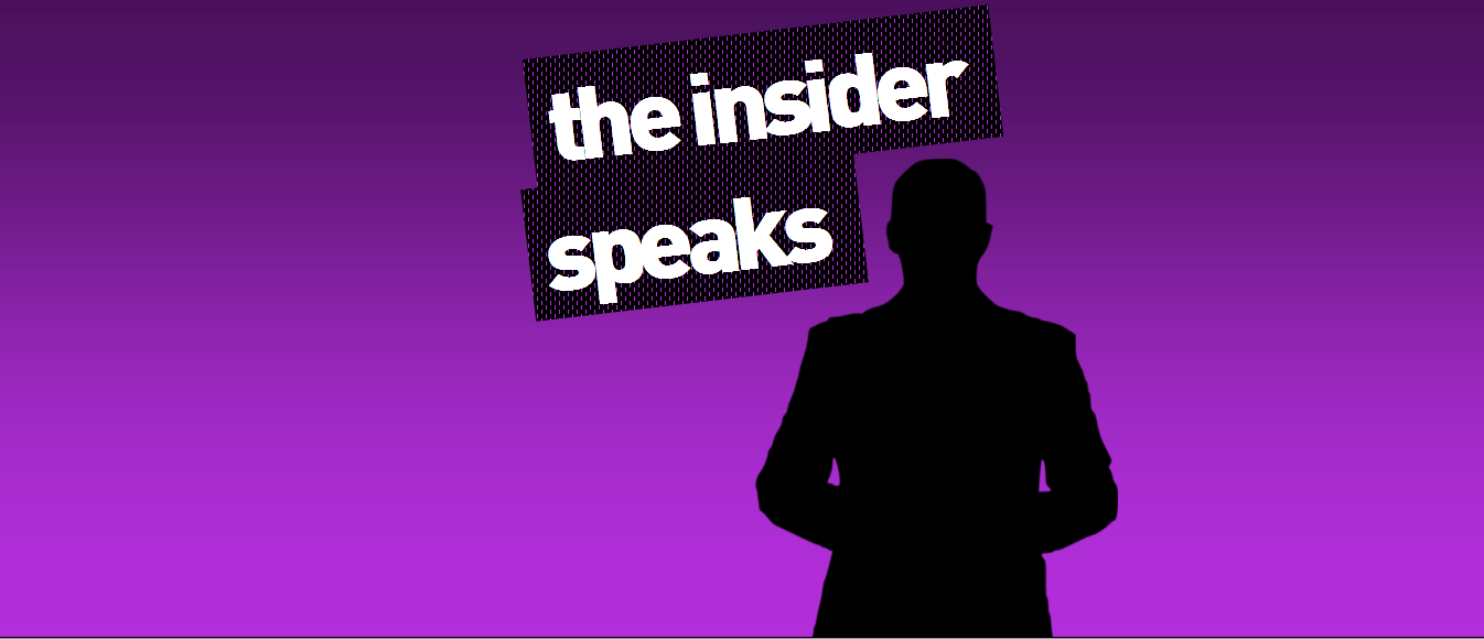
It’s the start of a brand new week here at Ears To The House, much like it is everywhere else today. So what better way to start the week than with the latest thoughts of The Insider – a high profile individual in the music industry who speaks truth to power from a position of anonymity.
Over the weekend, we got in touch with him to ask about the festival world – a topic we mentioned once or twice last week. And as always, The Insider didn’t mince his words, saying that our comparison of dance music festival to the equivalent of a McDonald’s – because they’ve all got much of the same lineup – is “absolutely bang on the money, and it’s getting worse, not better. This scene has never been so f***ed, and I’ve seen it f***ed before.”.
However, his most scathing words – not to mention the most amusing – were his thoughts on festival flyers. Now, we’re not ignorant here – since the days of the acid house flyers in the 1980s, the ones in the dance music world have never been known for their ingenuity or clarity. There may have been a golden age of dance music, but there has never been one for its flyers.
The Insider pointed us, in particular, to this flyer doing the rounds for the Amsterdam based Dekmantel Festival. We can only apologise in advance to anyone whose eyes feel traumatised by it…

As for The Insider, he said “Who the f*** approved of this? I don’t know where to begin analysing it. It’s not just the hideous, completely unreadable font. It’s not just the fact that blue and bright green contrast makes it utterly impossible for any c*** to read it. And if you think that’s bad, take a look at their website.”
So we did. And we already wish we hadn’t.
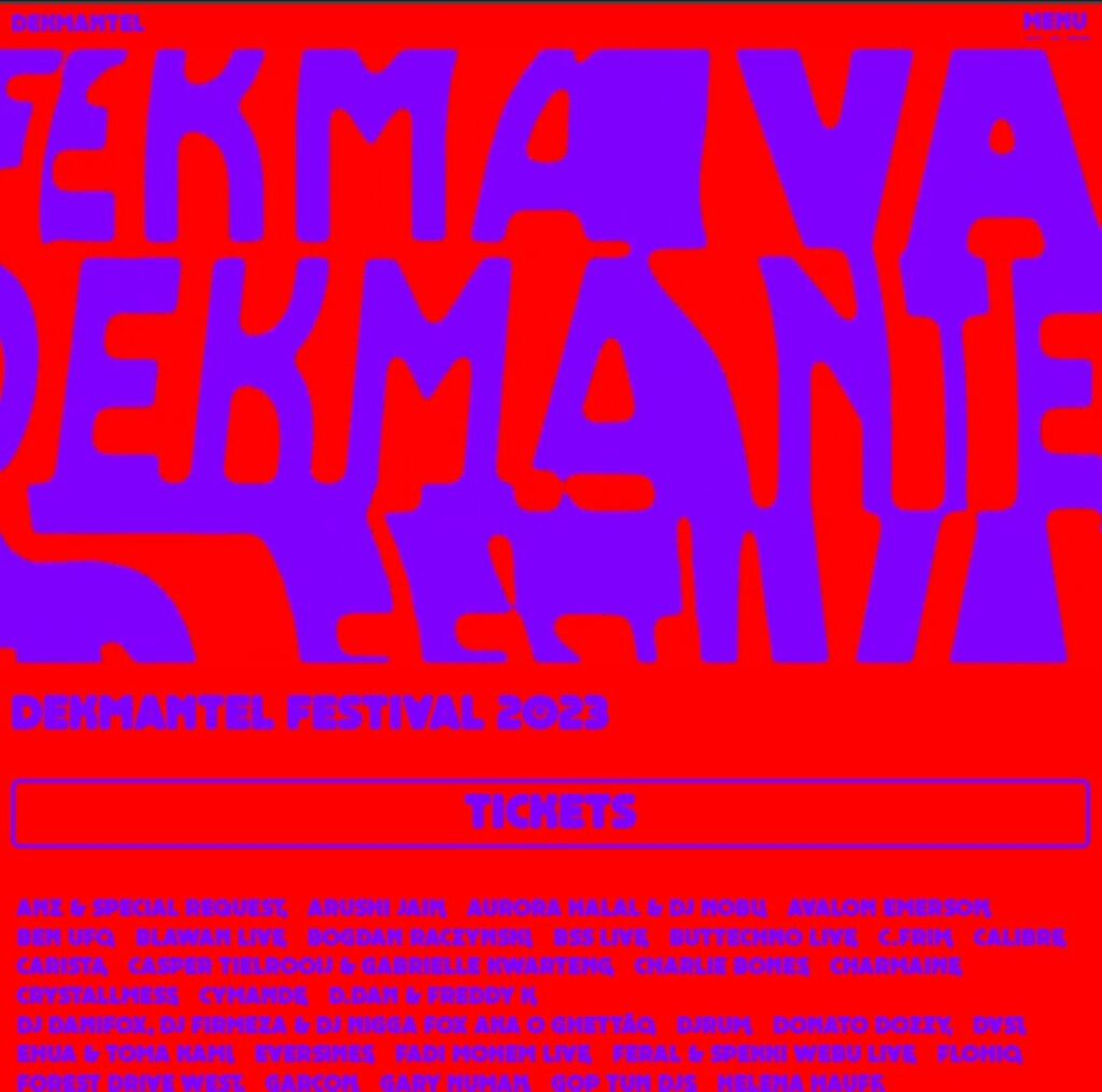
“Whoever approved of any this needs to seriously lose their job, because they clearly know f*** all about design, accessibility or anything. We used to take the p*** out of this stuff back when people would customise their MySpace profiles as to make sure no one would ever be able to f***ing read them. This deserves the p*** taken out of it just as much, if not more.”.
Judging by most of the comments underneath Dekmantel’s post last week revealing their flyer, The Insider is far from alone. Ears To The House contacted Dekmantel Festival to see if they had any defence or explanation for this – they haven’t yet responded.
Here’s hoping any response received is in a mildly legible font without a headache inducing shade of green background. It’s only Monday, after all…